Triangles in CSS
Creating triangles with CSS is a pretty good way to reduce the number of images within an application. They’re a bit tricky to get your head around at first but once you understand them it’s really easy.
Drawing a triangle
Lets say we are constructing a triangle to use as an up arrow, the first thing to do is to create an element with a size of 0x0. A bottom border is then applied to the element with the colour set as the colour of the triangle. Then add left and right borders to the element with the colour set to transparent.
.triangle {
  border-bottom: 15px solid #000;
  border-left: 10px solid transparent;
  border-right: 10px solid transparent;
  width: 0;
  height: 0;
}
This is the result:

Why did it come out in this shape? The three triangles in the triangle are actually the borders from .triangle. 10x15px triangles on the left and the right and the 20x15px triangle at the bottom.

This works because the element is of size 0x0px, which makes the border pointed on the size closest to the element’s inner container.
It’s easy to make a right-angle triangle too by removing border-right.

Pseudo-elements
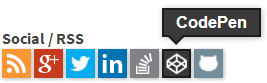
Triangles are usually drawn with the pseudo-elements ::before and ::after because this way they can be drawn to augment existing elements. A perfect example is this site’s (old) social icons, when hovered they have a little tooltip with an arrow popup.
This is done using a pseudo-element to create the arrow, then using position:absolute to position the triangle to the correct spot.
To get the pseudo-elements to work, a few standard rules are needed first so they will show up. These styles will print the original triangle from above but use the ::after pseudo-element.
.triangle::after {
  border-bottom: 15px solid #000;
  border-left: 10px solid transparent;
  border-right: 10px solid transparent;
  width: 0;
  height: 0;

  content: "";
  display: block;
}
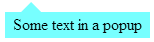
Given this, a text box can be added with the triangle.
<div class="popup">Some text in a popup</div>
.popup {
  background-color: #7FF;
  position: relative;
  display: inline-block;
  padding: .2em .5em;
}

.popup::after {
  border-bottom: 10px solid #7FF;
  border-left: 10px solid transparent;
  border-right: 10px solid transparent;
  width: 0;
  height: 0;

  content: "";
  display: block;
  position: absolute;
  bottom: 100%;
  left: 1em;
}
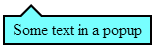
Adding a border
Adding a border to the triangle is another handy trick to have in your arsenal. This can be done by creating a ::before element as well, which will be another triangle that is slightly larger and shifted a little towards the top and left of the element so the border evenly surrounds the ::after triangle. This shifting can be done with either negative margins or the left, right, top, bottom properties.
.popup {
  background-color: #7FF;
  position: relative;
  display: inline-block;
  padding: .2em .5em;
  border: 2px solid #000;
  z-index: 0;
}

.popup::after,
.popup::before {
  width: 0;
  height: 0;
  content: "";
  display: block;
  position: absolute;
  bottom: 100%;
  left: 1em;
}

.popup::after {
  border-bottom: 10px solid #7FF;
  border-left: 10px solid transparent;
  border-right: 10px solid transparent;
  z-index: 1;
  margin-top: 1px;
}

.popup::before {
  border-bottom: 13px solid #000;
  border-left: 13px solid transparent;
  border-right: 13px solid transparent;
  margin-top: -3px;
  margin-left: -3px;
  z-index: -100;
}
Examples
Here are some flexible styles for triangles taking advantage of pseudo-elements written in Sass.
See the Pen Triangles in CSS by Daniel Imms (@Tyriar) on CodePen


