Redesign #3: From Blogger to GitHub Pages
Another year, another redesign. This post will look at the recent overhaul to my blog, going over the new design and feature changes.
This time I didn’t actually set out to fully redesign the site again like last time. I originally set out to simply migrate off Blogger onto some other platform. It started around 6 months ago in the little free time I had, starting to migrate all of my Blogger posts to Markdown. This took considerably longer than I originally thought it would, in some cases I had to rearrange everything in the post to bring it up to standard. As time went on I kept seeing more and more problems and my expectations for the upgrade got higher and higher.
HTML → Markdown
My original motivation this time was to make writing posts and maintaining posts as easy as possible. A workflow that is more programmer-friendly, having direct access to the files instead of dealing with Blogger’s gigantic template or UI. So all 128 posts are now written in Markdown, improving style consistency and simplifying markup. Plus it makes writing posts in the future much easier.
Blogger → GitHub Pages
GitHub Pages is powered by the static site generator Jekyll. A GitHub Pages site is backed by a GitHub repository and whenever a commit is pushed to it, the site is recompiled. The great thing about this is that if there’s a compilation error (that slipped past local testing), the old site is retained and an email is sent to the repository owner. It’s also much easier to setup, with no costs (unless you use a private repo) and you don’t need to deal with any web hosting companies.
The one downside I’ve found with GitHub Pages is that Jekyll plugins can’t be installed which removes some of the customisation power of Jekyll. This is due to the valid security concern of not wanting to run arbitrary Ruby on their servers. Any gaps that have come out of this I’ve filled in using client-side JavaScript.
#perfmatters
I really focused on performance this time around and I’m happy to say that I pushed the page load time for all pages down significantly. Pages now load over 50% faster than their previous incarnations! I’m going to write a separate article on the numbers and techniques I used as there’s a lot to be said about them.
New stuff
Explore page
I’ve implemented an Explore page which allows searching for posts via tags. The page itself actually contains all posts on the blog in a fairly light-weight manner so Ctrl + F works pretty good too.
Search bar
The new search bar has been in place for several months now. It’s hooked up to a <datalist> which provides auto-completion for all tags on the blog. If the search term is one of those tags it will redirect the user to the explore page with that tag selected, otherwise it will do a Google search localised to this site.
SVG everywhere
SVG images are now nearly everywhere, including the logo and most posts where applicable. This means images will be super crisp on any device, no matter the pixel density of the display.
I’ve opted for this approach instead of the multiple png images I was using before because a single SVG is far easier to maintain than multiple images. This has a side effect of completely breaking the site for IE8 and below, however <= IE8 users are such a small percentage of my audience that it doesn’t bother me (~1.5% and dropping).
External posts
I can now post external URLs to the blog and the feed, I’ve added this to push out content I’ve written on external sites (like my recent article on thesassway.com) to subscribers.
Wider content
Screen real estate on wider displays is used better now. Certain images, tables, code and demos will break out of the content column and into the right portion of the page.
Content discovery
There are two new content discovery features that are a little less obtrusive than the old “featured” articles that appeared just below the header in the old design.
The top articles page which can be accessed from the top navigation provides some of the best content without needing to search around for it. Also, all posts now contain a related posts section at the bottom. The related posts are based on the post’s ‘primary tag’, so it should provide relevant links to the reader at the right time.
Comments
I disabled Google+ integration as I wasn’t too happy with it for multiple reasons. I’ve moved over to Disqus for comments, being pretty impressed recently as a user of their service. Their embed scripts are asynchronous too so it won’t slow down the page load’s critical path.
Social metadata
I’ve implemented Open Graph and schema.org microdata tags so sharing to social networks will be able to pull more information about the article.
Wrap up
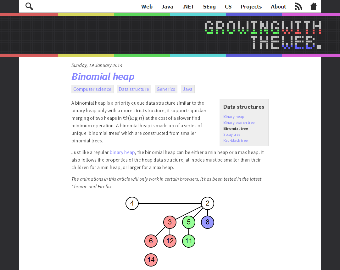
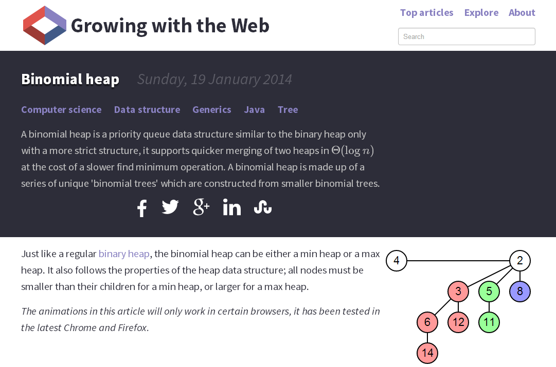
I’ve been itching to get back into my normal writing schedule while working on the upgrade, so I’ll leave it there. Here are a couple of comparison shots of the new and old. As is tradition.
Old

New


