Redesign #2
I only just redesigned the blog back in September, but something has been bugging me since around a week after I did it. The readability completely sucked, I found myself preferring Google Reader or the Blogger backend over reading from the blog itself! Not good…
So I spent a bit of time here and there over the last month or so getting the design just right and then ramping up towards the end with the implementation. I used Sass this time as the changes being made were pretty significant. Here are the results.
Goals
Here are the goals that I wanted to accomplish and their outcomes.
Improve readability
I made the background white, increased line-height, added spacing and used a nicer font. The result turned out better than I had imagined it would. It’s amazing how much of a difference only a few changes can make.
Make the blog responsive
If you resize your window the blog should now resize with it. There are 4 breakpoints when I thought things started to look a little broken, small screens should see the title in plain text and the widgets stacked underneath the blog.
Introduce high-pixel density assets
Now that I have a Nexus 10 I can finally test using high-pixel density assets in web pages, it was one of the reasons that I got it. So some of the new assets use double sized versions and they look terrific!
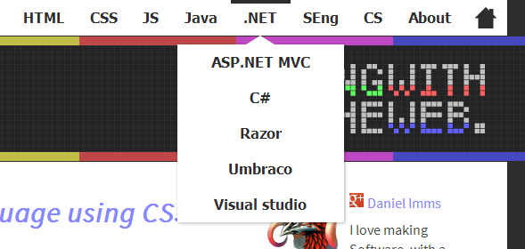
Make a more flexible menu
The problem with the old menu was that it was simply 6 static links and that was it. No sub-menus, no possibility of increasing the amount of links either as they were colour coded and it would have looked strange.
The new menu completely fixed that problem, it’s definitely my favourite part of the new design.
The menu does sort of ‘break’ when the screen is just larger than the smallest responsive breakpoint. Menu items go missing due to the screen not being wide enough. This isn’t that big of a deal though as all of the menu items point at blog labels which are available at the bottom of the blog, excluding About which will always show.
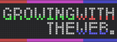
Make an interactive title - failed :(
While I did spend quite a bit of time developing an interactive title using canvas, the performance hit when resizing the window I just didn’t find acceptable. It’s a shame because it was shaping up to be pretty cool.
I did however fix the contrast issues that the old title had, which I was planning on fixing up right after I had put it up originally :P
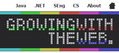
Old
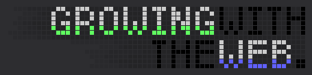
New
Outcome
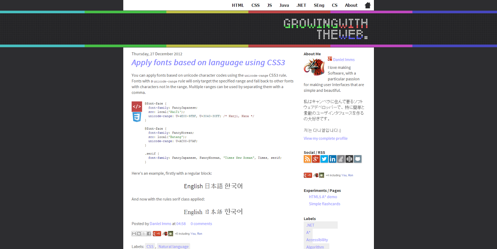
Before
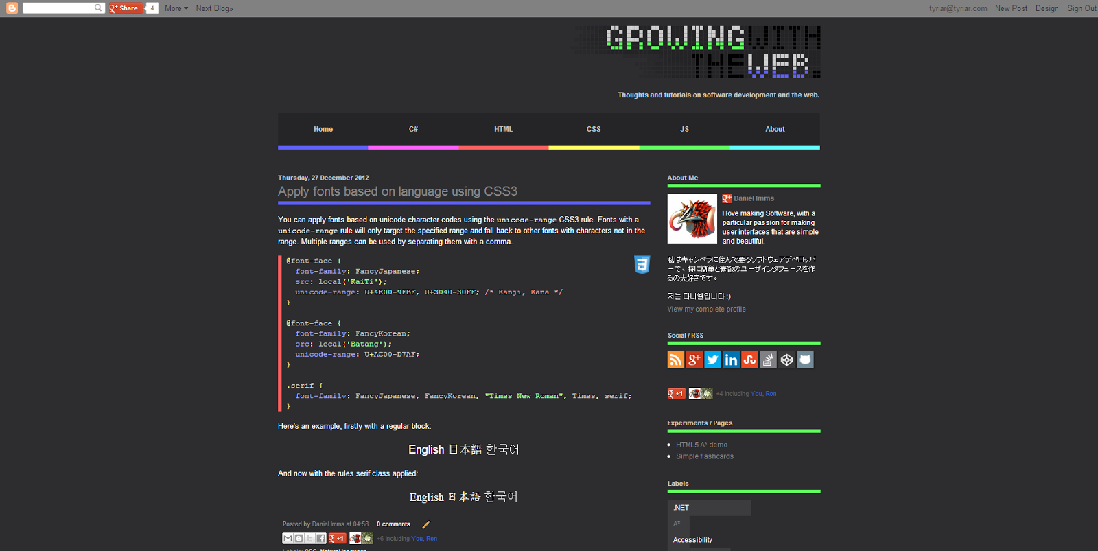
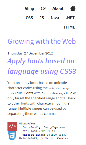
After